UBS Portfolio Reporting Tool
UBS Reporting Tool Redesign
Overview
Overview
Project Name
Project Name
PMR (Portfolio Management Reporting) Tool
Client
UBS
My Role
Research, wire-framing, prototyping, user-testing, symbol creation and library management, UI Design
Final Product
High Fidelity Mock Ups, High Fidelity Prototype, User Testing and Research Readout
Dates
September 2019 – December 2019
The goal for this project was to design the future digital Client Review experience for FAs and CSAs, incorporating it into the daily advisor life cycle. Streamline and update the PMR digital tool from all entry points. Our plan is to design an enhanced experience around financial planning. We want to create a simple, integrated and intuitive experience for users that is incorporated into their day-to-day work flow.
Goals
• Identify and reduce barriers to entry to improve adoption of planning
• Make planning simple to increase user satisfaction and Advisor effectiveness
• Update the experience based around user / client needs.
Users Of The Tool
Users Of The Tool

FAs
The Financial Advisors
work as bridges to the UBS clients. They gather information about their financial state, their life goals, etc. and produce a financial plan for them to achieve it. They often meet their clients a minimum of 4 times a year to check in and adjust financial plans to meet changes to their lives and needs.

CSAs
A Certified Senior Advisor
is an operations assistant to an FA. They will often work to take discovery information from an FA and translate it into a plan. Or when plans are approved, they take the planning information and either trade it into existence or hand it off to other members who handle that.
Interviews
Interviews
We spoke in group conversations with representatives from the PMR, MTS (Market Tech Specialist), Operations, and UBS Design teams to validate these pain points and find out if there was more to uncover. With these groups, we had followed these following areas of inquiry:

What are other areas of the business hearing from FAs regarding PMR?
The feedback articulated in all conversations added depth and nuance, and were aligned with what previous work had already uncovered. Customizations that had already been put in place for the benefit of FA's were so vast and extensive that it ended up confusing them instead of helping them.
“The customization is a slippery slope – it's so great that we have them all, but [it’s] overwhelming.
If they could see what’s happening in the report, it would really help eliminate confusion about what they're customizing.” – MTS
“We usually get questions once they user has already read the report. They are coming to us with questions when there is something wrong with the data.” – OperationsNew Paragraph
What additional insights can our SMEs (Subject Matter Experts) provide?
SMEs from the Operations team shared their experiences using reporting systems at other financial institutions. Based on these conversations, they were able to express what they appreciated most about those experiences.
• Visual Library of Exhibits
• Marketing and Education Content
• Drag and Drop
• Dynamic Customization


What does a successful new PMR look like, from their unique perspectives?
A successful new PMR experience must be visually dynamic and more seamlessly integrated,
but not so different that it alienates users. Users of the PMR tool have been using the product for several years; they needed to be able to transition easily to the new system, so as to not interfere with their work.
“I think it's going to be important [moving forward] to keep the workflow consistent.”
“The customization options were more dynamic and in-your-face.”
“We want to provide a seamless experience that just naturally flows
as they do their work.”
Design Directives
Design Directives
Based on the interviews and insights that we were able to pull from affinity diagrams, we were able to pull the following guiding principles and design directives.
Access & Structure
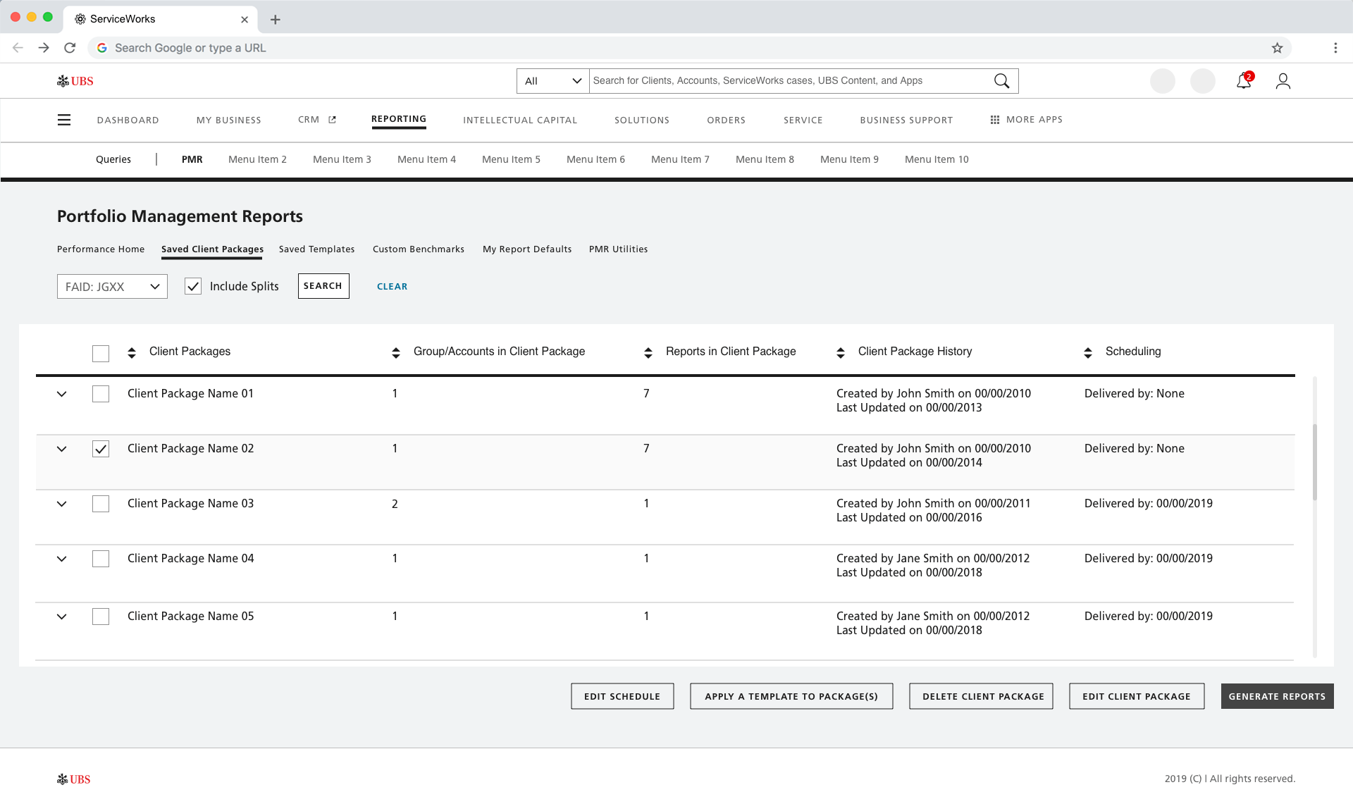
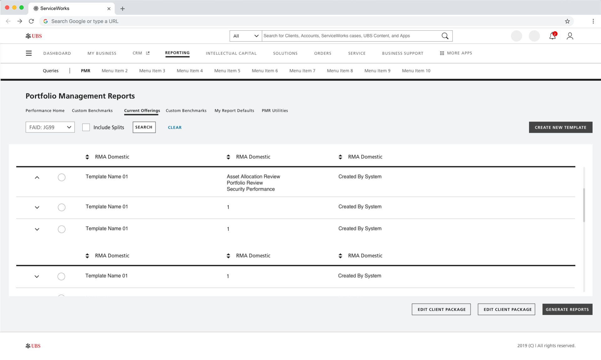
The current structures of the system and tools are convoluted; the PMR tool is a 10 year old product that has never been updated consistently throughout
Moving forward, we need to create a solution that integrates seamlessly with UBS’s other portfolio management tools.
Decentralized Experience
Within the current state of the PMR tool, the features, capabilities, and experiences are vastly different depending on where the user initiates the report generation process.
We need to be able to connect the user to the same tool, experience, and features from all access points.
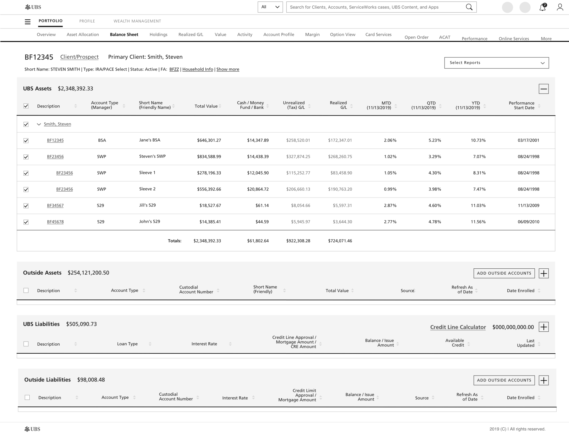
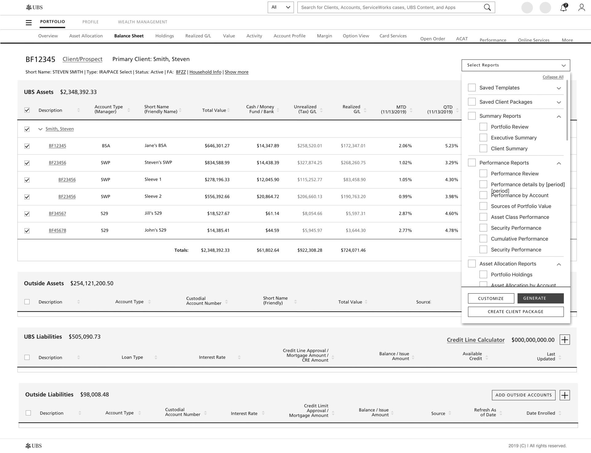
User Interface
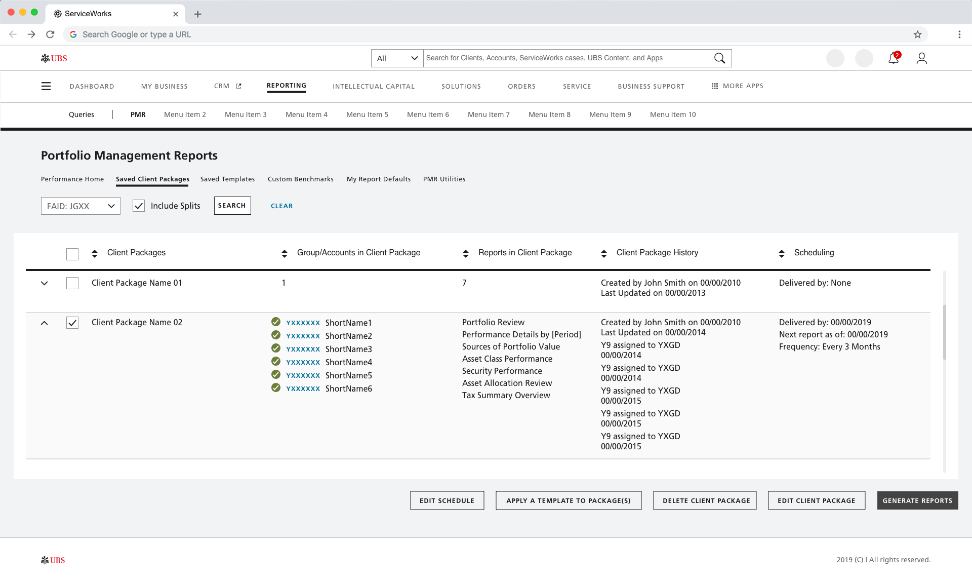
Current interface is dated, inconsistent and disorganized, and does not provide on-screen insight to data prior to report generation.
The new tool needs to be enhanced with new interactions and patterns already in flight with their other products and system. It needs to be able to provide quick access to data on screen.
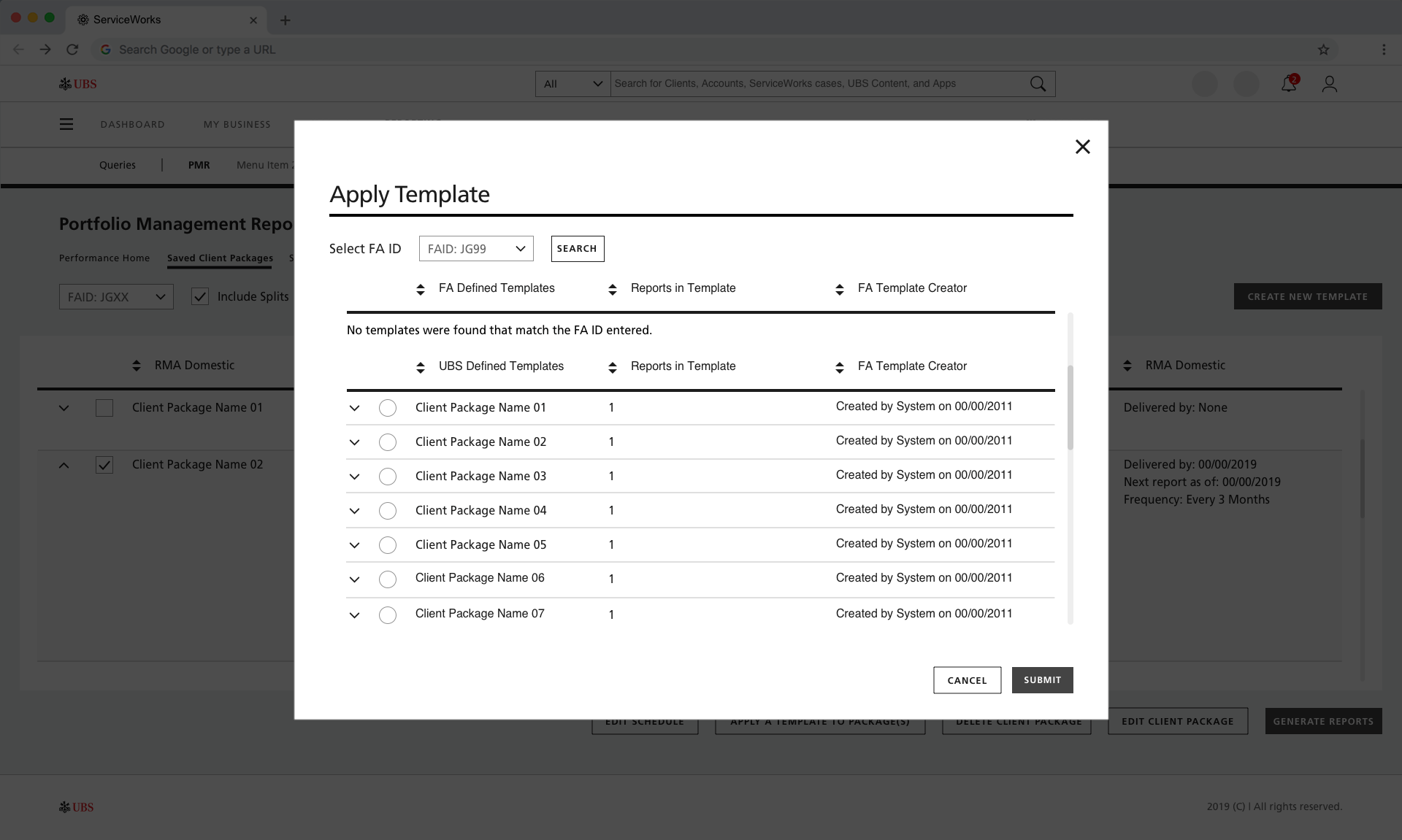
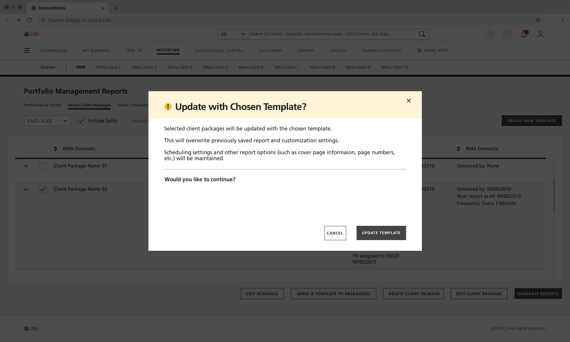
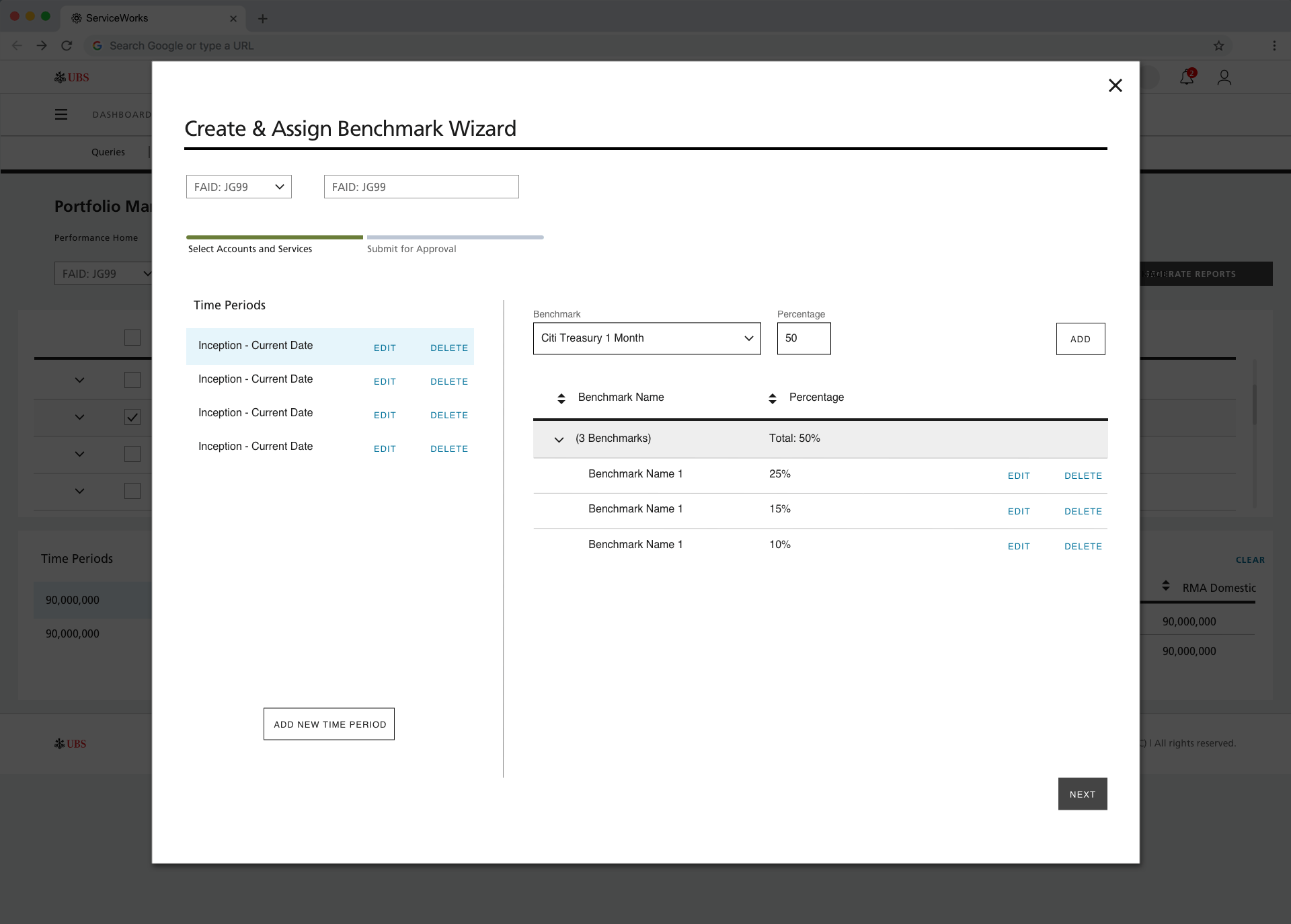
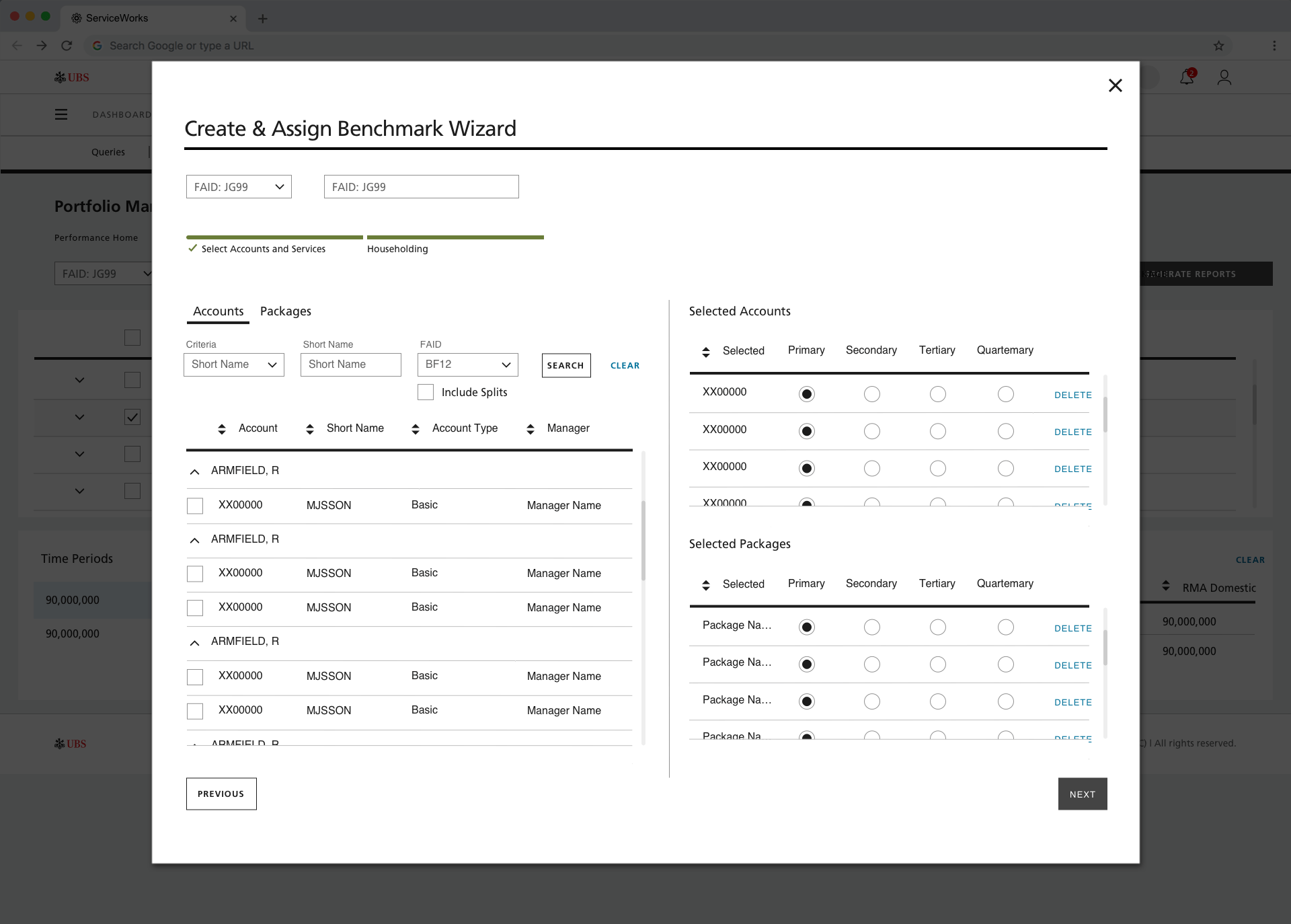
Customization
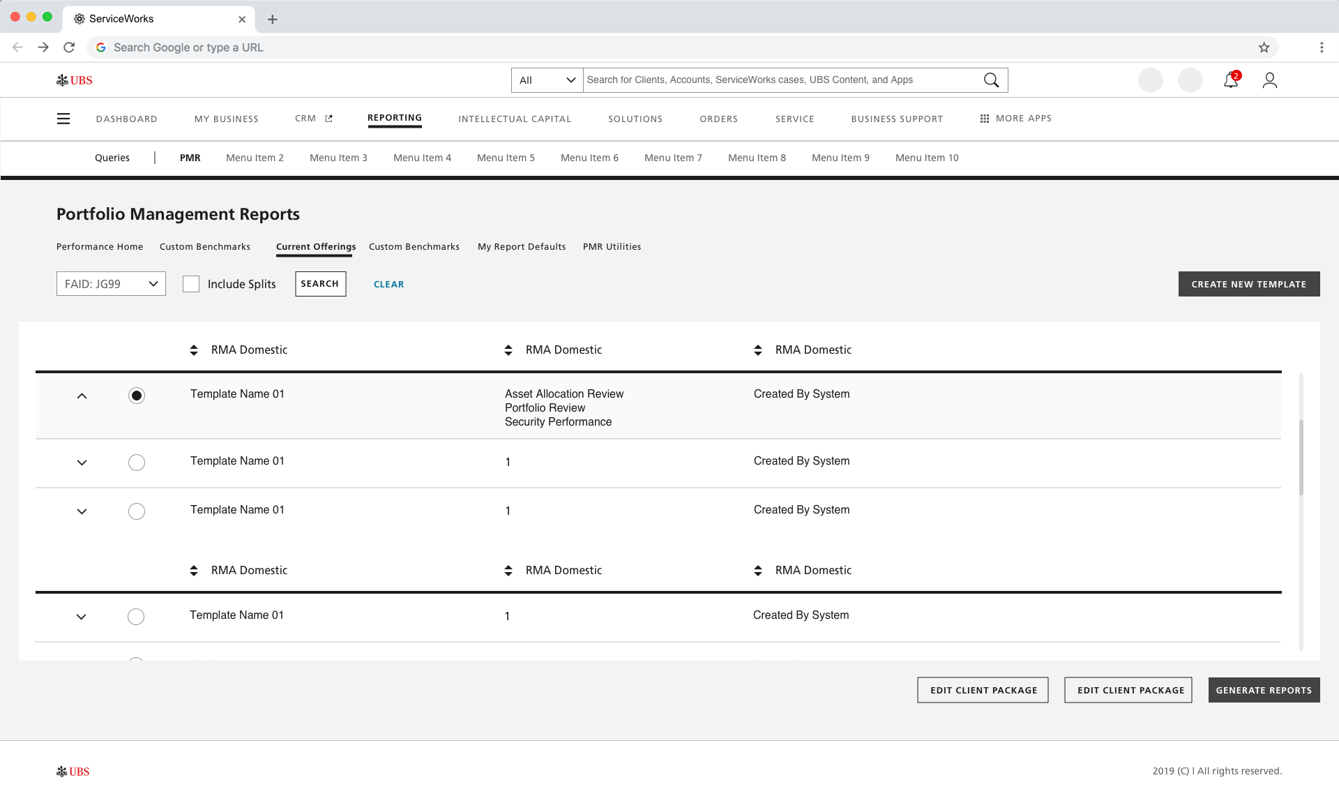
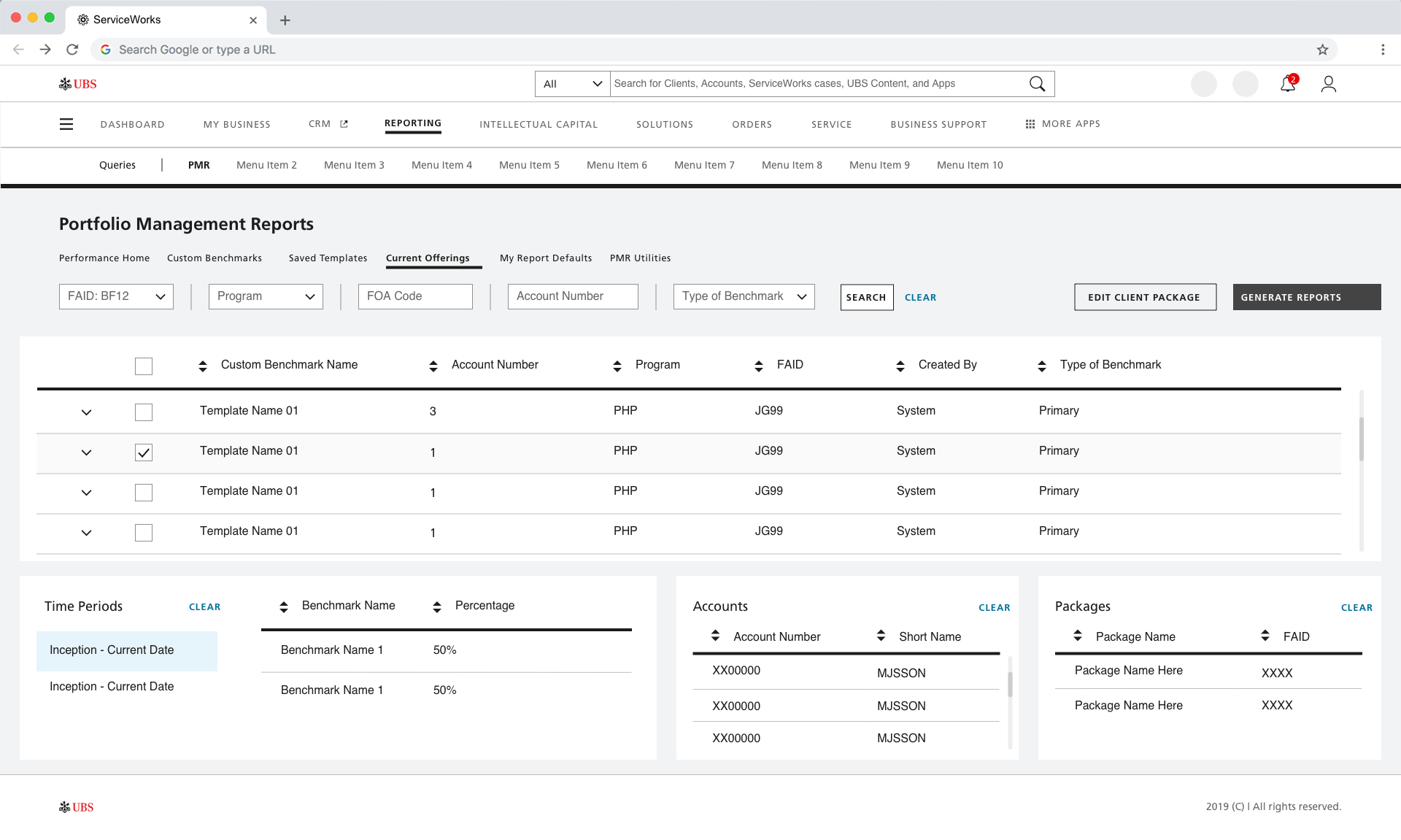
Despite in-depth customization options, there are places of unexpected inflexibility and lack of clarity in how they’re displayed.
The PMR tool needs to have dynamic editing and customization capabilities using real data.
Wireframes & Testing
Wireframes & Testing
Approach
Approach
We developed scenarios that provided a series of real-world tasks, both to guide them to the interactive parts of the prototypes, and to prompt comments on specific functionality that is altered or added new.
To understand the pain point that users currently face, we asked two questions: What is your current experience with the current
PMR tool and how would you rate the current report generation tool?
These were the results:
6 out of 10
stated that it was not a user-friendly interface
5 out of 10
complained that they disliked not being able to see the report with customizations before generating it
4 out of 10
stated that they needed need more customization, just the ability to understand/locate them
There was a resounding 3.0 out of 5.0
rating for all participates when asked to rate the current PMR tool
There was overwhelming support from the testers that there was a need to revamp the interface
Findings
Findings
There was overwhelming support from the testers that there was a need to revamp the interface
Here are the following results based on the user testing:
10 out of 10
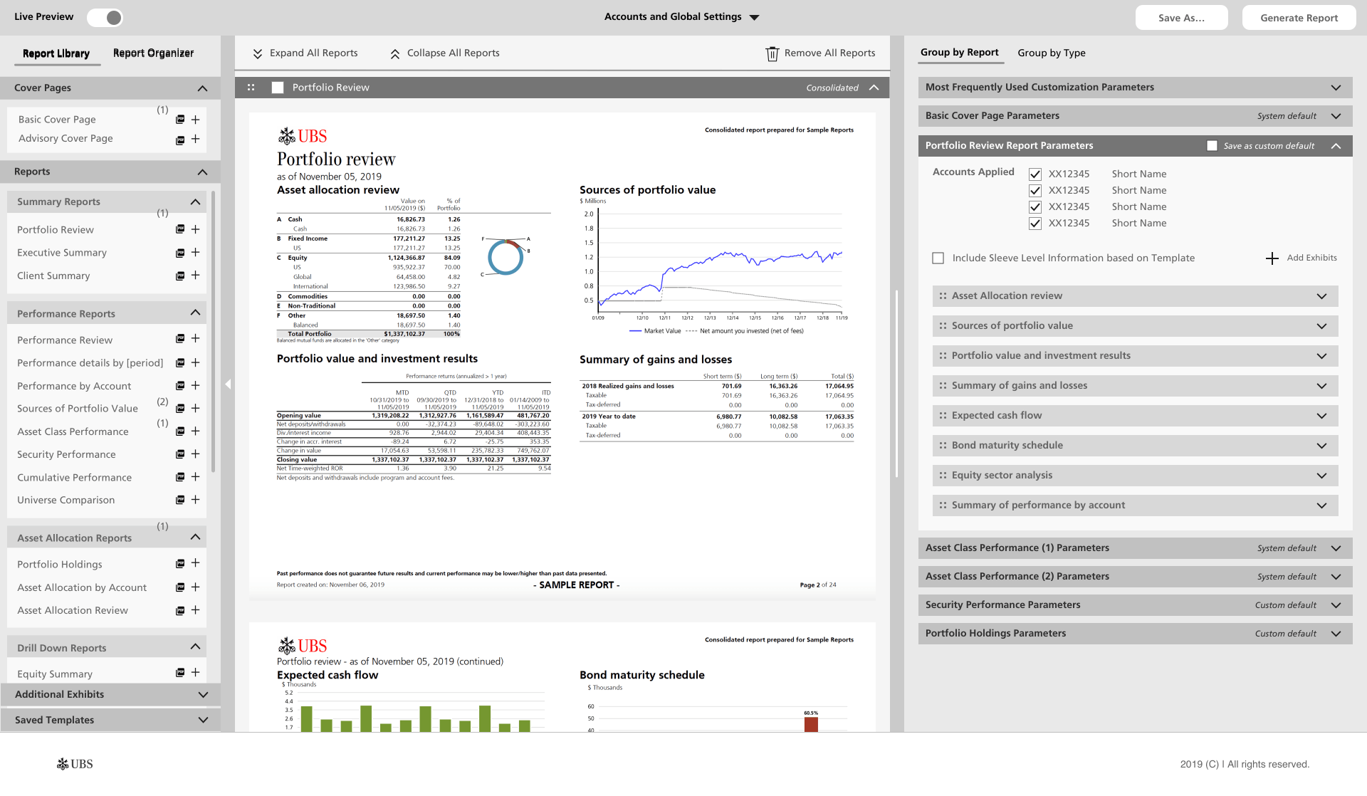
were please with the fact that there was a live preview of the report in the center of the page
8 out 10
people understand and appreciated the three column layout and the flexibility it provided
9 out of 10
stated that there was nothing wrong with the new interface
4 out of 10
wished there were more consolidation options for the reports or that the presented options we a bit more clear
2 out of 10
were frustrated that certain customizations weren't there
In terms of ratings, there was a consensus of 4.0 out of 5.0
when asked is the tool was easy to use and how much of an impact it would have on workflow
When asked 'if the current tool and this tool were both available tomorrow, how likely would you be to choose this tool?', everyone gave a strong 5.0 out of 5.0.
Some of them deliberately exceeded the scale, providing an average of 5.3
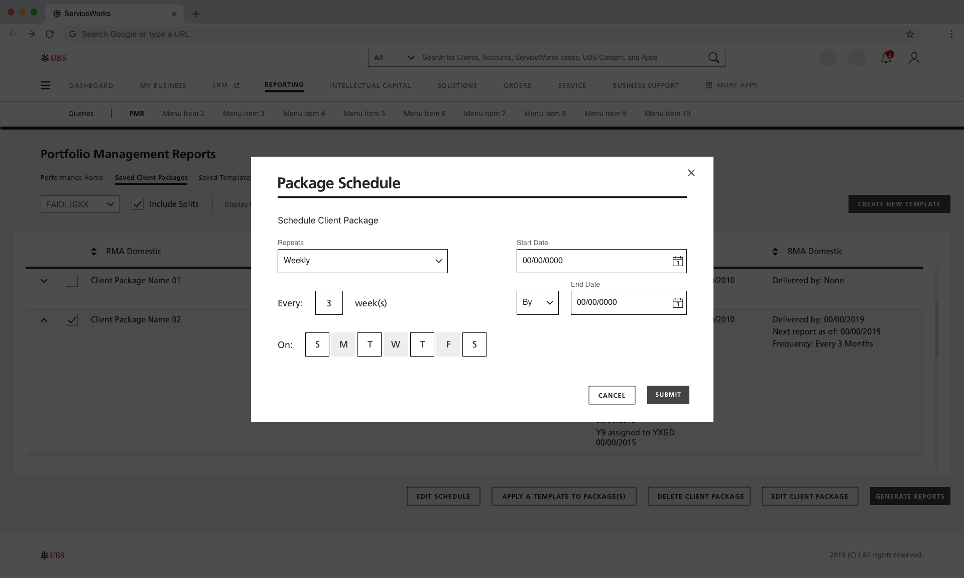
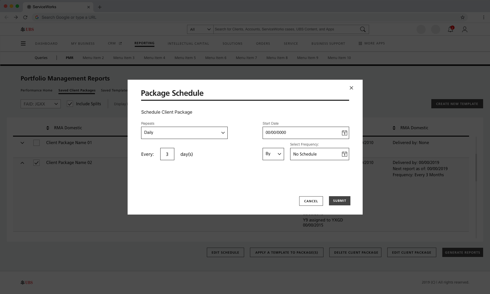
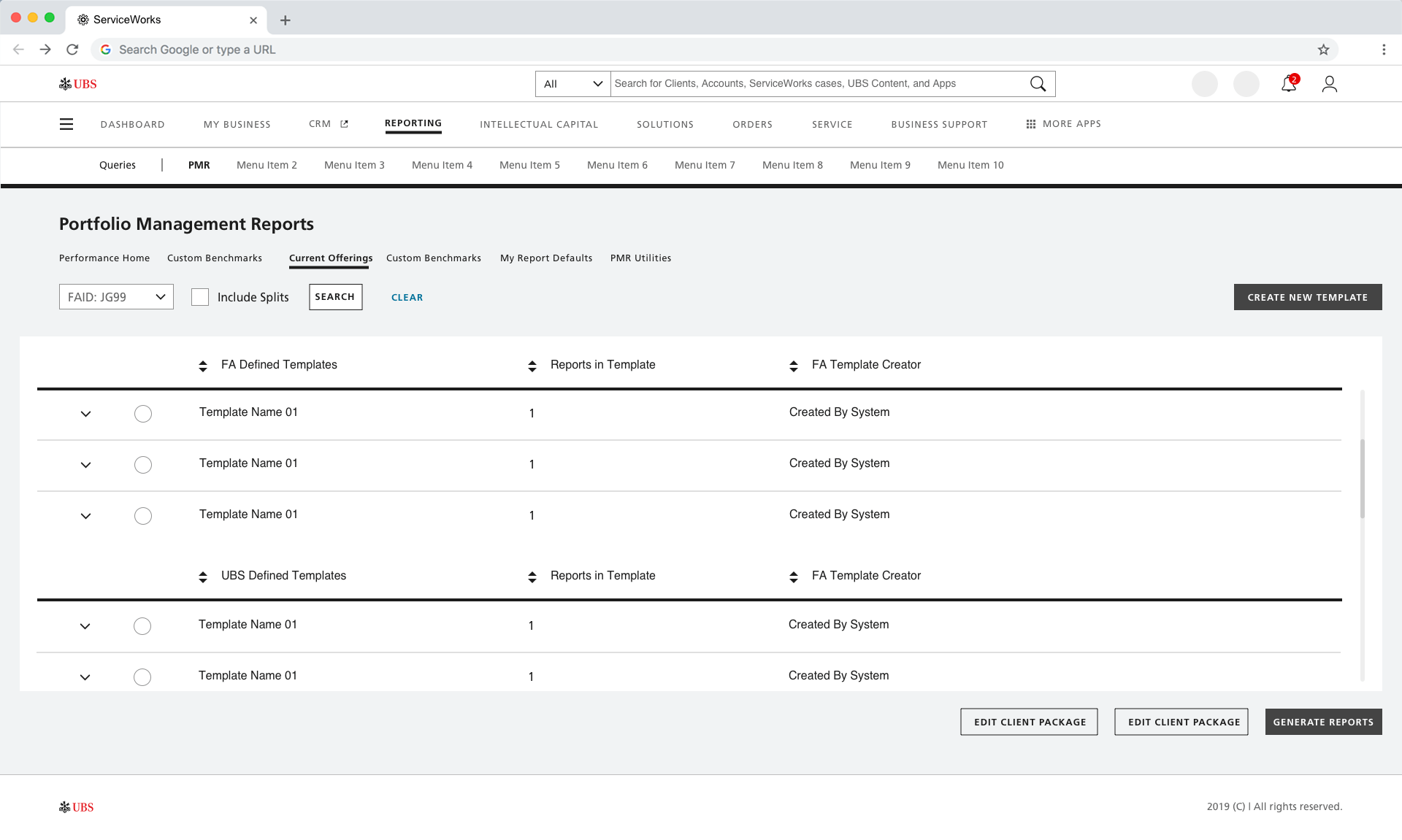
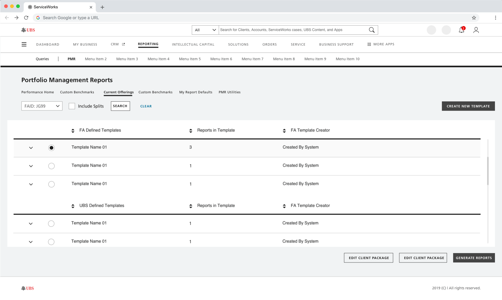
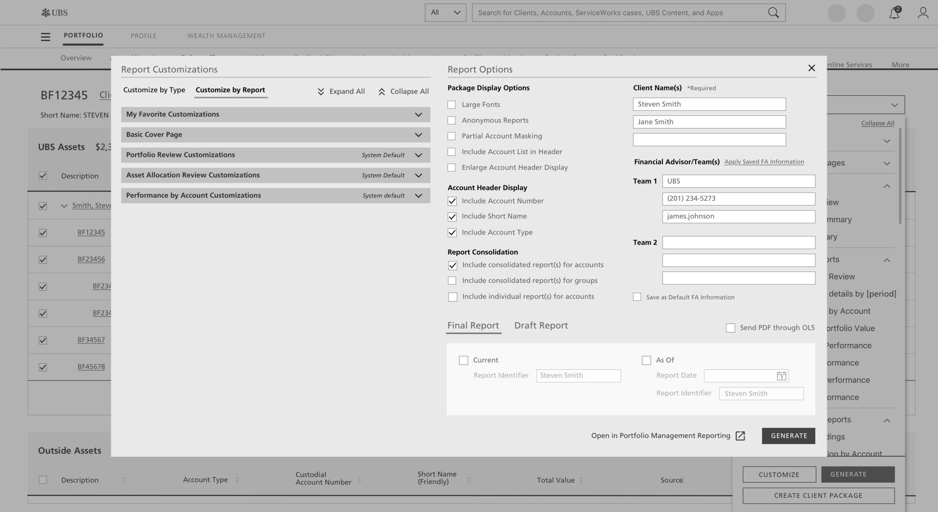
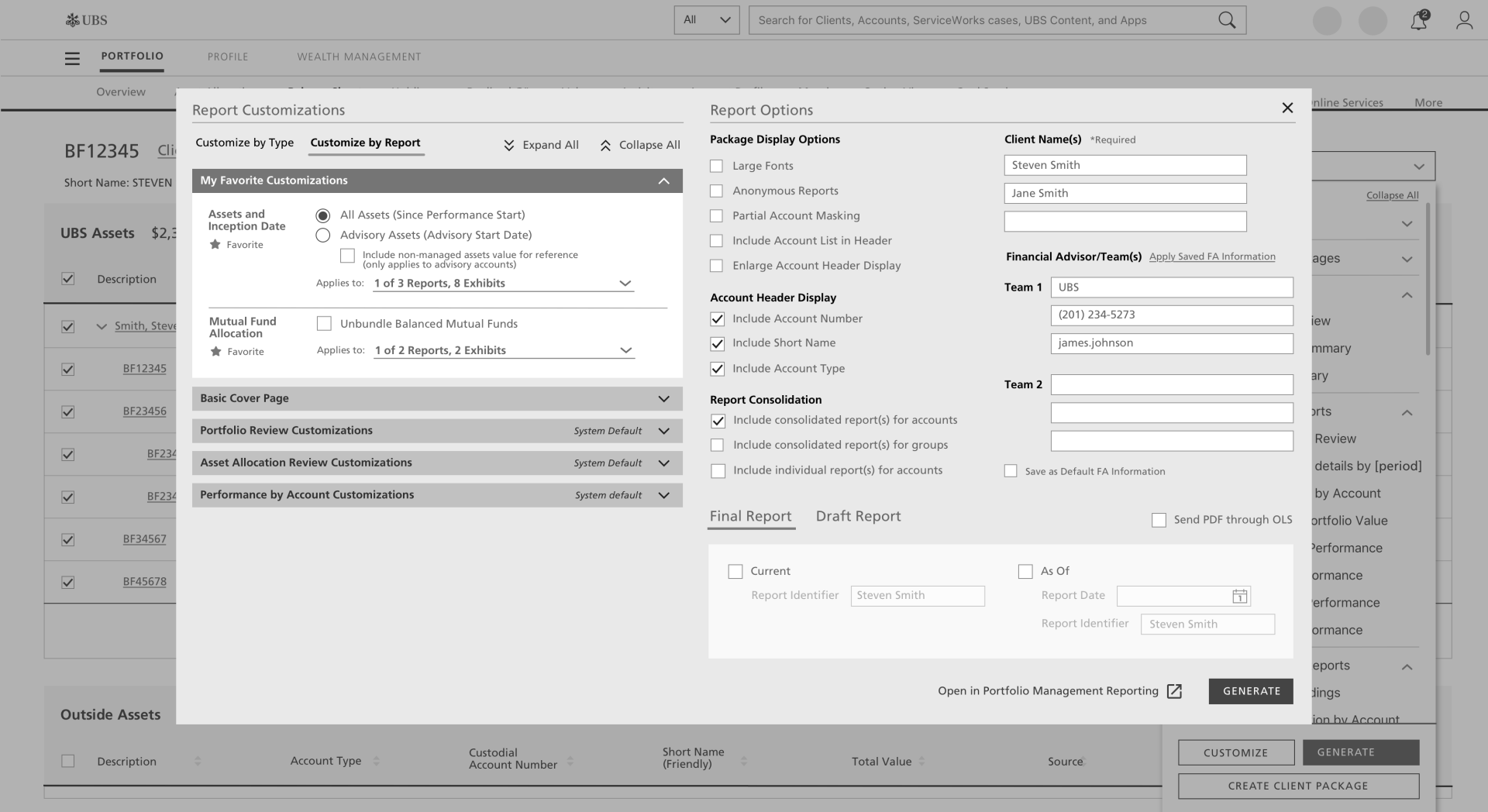
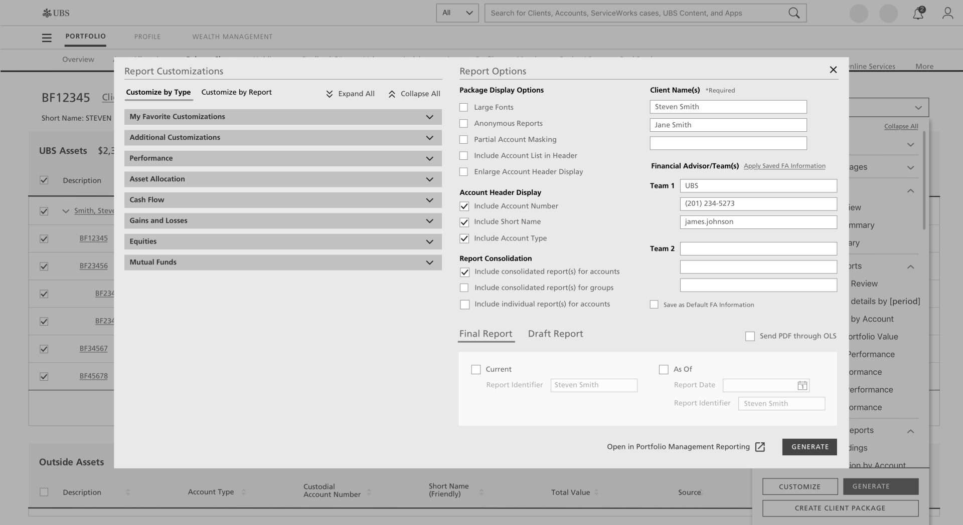
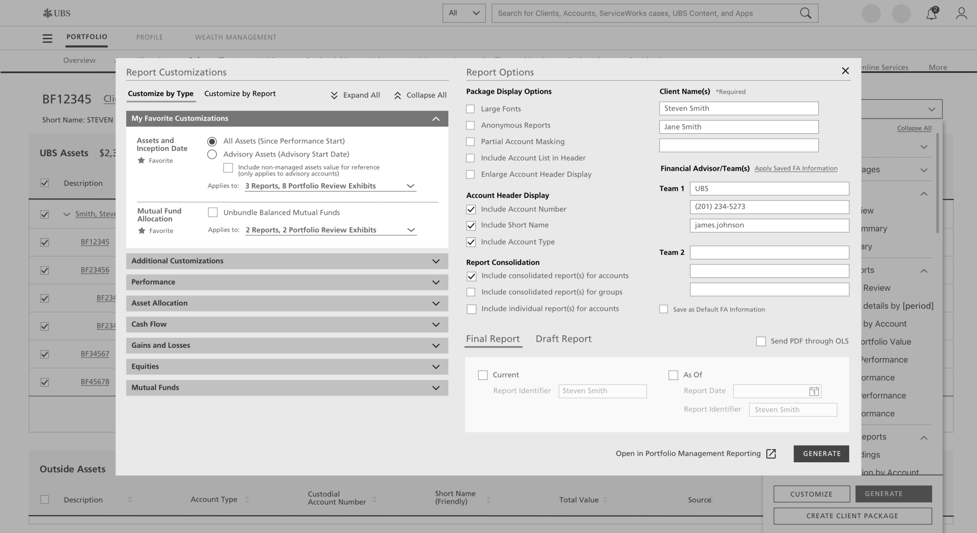
UI Redesign
UI Redesign
While we were completely changing the process in which CSAs and FAs created reports for their client portfolio reviews, we were also in the process of revamping the overall tool to reflect the new styling.